ABOUT

Hey, I’m Manaz — a Toronto-based UX/UI Designer currently working at Intact Insurance, where I help shape better digital experiences across multiple brands so millions of people can feel more confident and comfortable using insurance products.
I’m passionate about designing products that aren’t just easy to use, but that also make a positive impact on people, businesses, and society.
With over 10 years of hands-on design experience, a Master’s in Visual Communications, and a Bachelor’s in Graphic Design, DESIGN has always been a huge part of my life. It’s not just my career — it’s how I see the world. Whether I’m styling a look that feels totally me, making my home feel modern yet cozy, or painting something for a blank wall, I’m always thinking about how to make things better, more beautiful, and more meaningful.
I also enjoy working with HTML, CSS, and a bit of JavaScript — it’s exciting to bring designs to life in code. Plus, it helps me speak the same language as developers (and they say I speak “Code” without an accent 😉).
Interested in chatting about design or creative ideas? Let’s grab a coffee and connect!

info@manazsadeq.com

COMPANY

Business Exchange

MY ROLE

UX UI designer

SUMMARY

Business Exchange is a real estate marketplace that connects buyers and sellers with businesses, franchises, and commercial properties. Its primary goal is to generate a high volume of qualified leads, helping users find the right opportunities efficiently and effectively.


Led the UX/UI redesign of key pages for the Business Exchange website, including the Homepage Search Bar, Listing pages, Checkout, Pricing and Plan page, and Client/Profile pages.

As a result, overall usability and accessibility significantly improved, leading to a smoother user journey and increased user satisfaction.
The redesign also contributed to higher engagement, reduced bounce rates, and improved conversion across key user flows.


Designed a mobile app for a business exchange platform, focusing on usability, smooth navigation, and a clean, professional interface to support seamless business interactions.

HOMEPAGE SEARCH BAR DESIGN

PROBLEM & CHALLENGE

  • For the Business Exchange, the Homepage Search Bar is the most frequently used feature on their website. The Search Bar was difficult for users to locate and lacked effective filtering options.
  • With a content-heavy site, users struggled to find relevant listings quickly, leading to frustration and high bounce rates.
  • The content-heavy layout made it difficult to find relevant listings quickly
  • The challenge was to redesign the Homepage Search Bar to ensure better visibility, usability, and the ability to filter results clearly, while addressing the complexities of categorizing and displaying large amounts of data efficiently.
  • SOLUTION

  • Redesigned the Homepage Search Bar to be more visible and intuitive, improving accessibility with proper labels and keyboard navigation
  • Added the most relevant filters (e.g. location, price, type and category) and structured search results into clear categories. This helped users narrow down results quickly and improved the overall user experience.
  • Validated the changes through prototyping and usability testing.
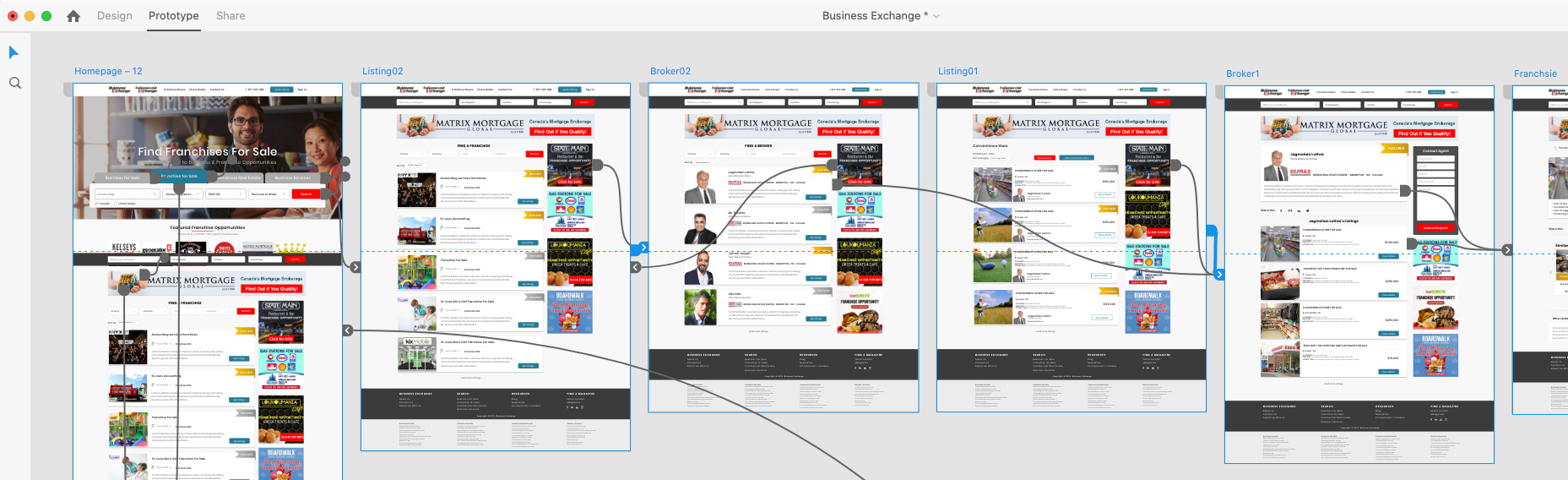
  • LISTING PAGES REDESIGN AND PROTOTYPING

    PROBLEM & CHALLENGE

  • Listing pages serve as the "catalog" of the site, displaying search results or filtered categories. However, the previous layout made it difficult for users to quickly scan, compare, and engage with listings.
  • The lack of visual hierarchy and limited use of product popularity indicators made the experience less intuitive and less engaging for users.
  • SOLUTION

  • Implemented a Card-Based User Interface to present listings in a visually balanced and scannable format.
  • Introduced tags to highlight bestsellers, guiding users toward popular options and encouraging engagement.
  • Designed the interface to improve usability and visual appeal, allowing users to compare listings quickly without needing to focus heavily on specifications.


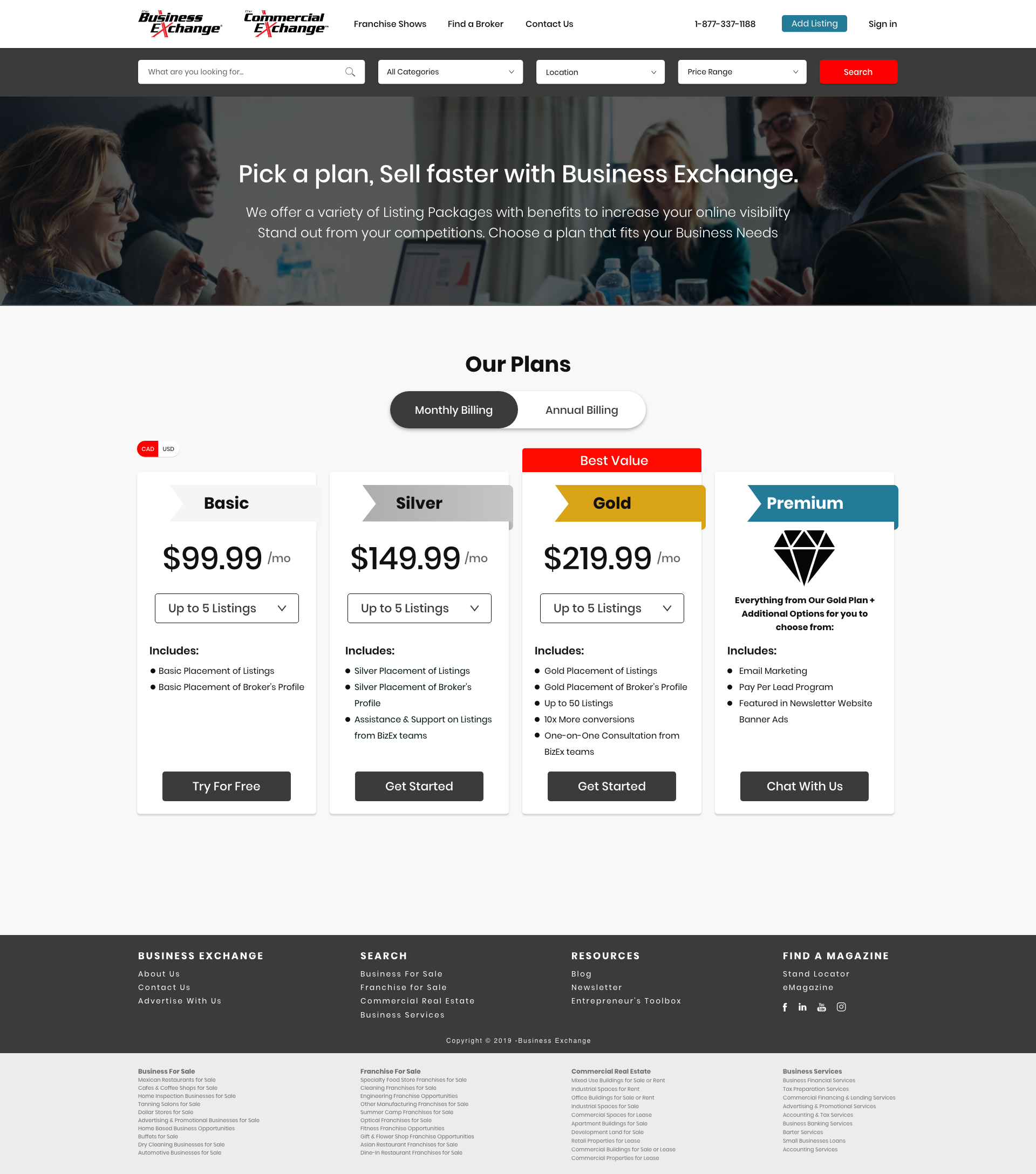
  • PRICING & PLANS PAGE REDESIGN AND PROTOTYPING

    PROBLEM & CHALLENGE

  • Users found it difficult to compare plans and understand the value of each tier on the pricing page.
  • Analytics showed high bounce rates and low conversions, especially on mobile devices.
  • The content-heavy layout made it difficult to find relevant listings quickly
  • Visitors felt overwhelmed by too much information, lack of clarity in feature differences, and aren't confident in selecting the right plan.
  • SOLUTION

    I redesigned the page focusing on clarity, scannability, and guided decision-making. key changes included:

  • Comparison toggle: Introduced a toggle to switch between monthly and annual pricing, keeping the interface clean.
  • Plan Highlighting: Highlighted the most popular plan with visual emphasis to guide user decision-making.
  • Mobile Design optimization: Implemented horizontally swipeable pricing cards with partial visibility of adjacent cards, signaling more options.
  • Positioned Monthly/Annual Toggle above the cards, centred, allowing effortless switching between billing options.
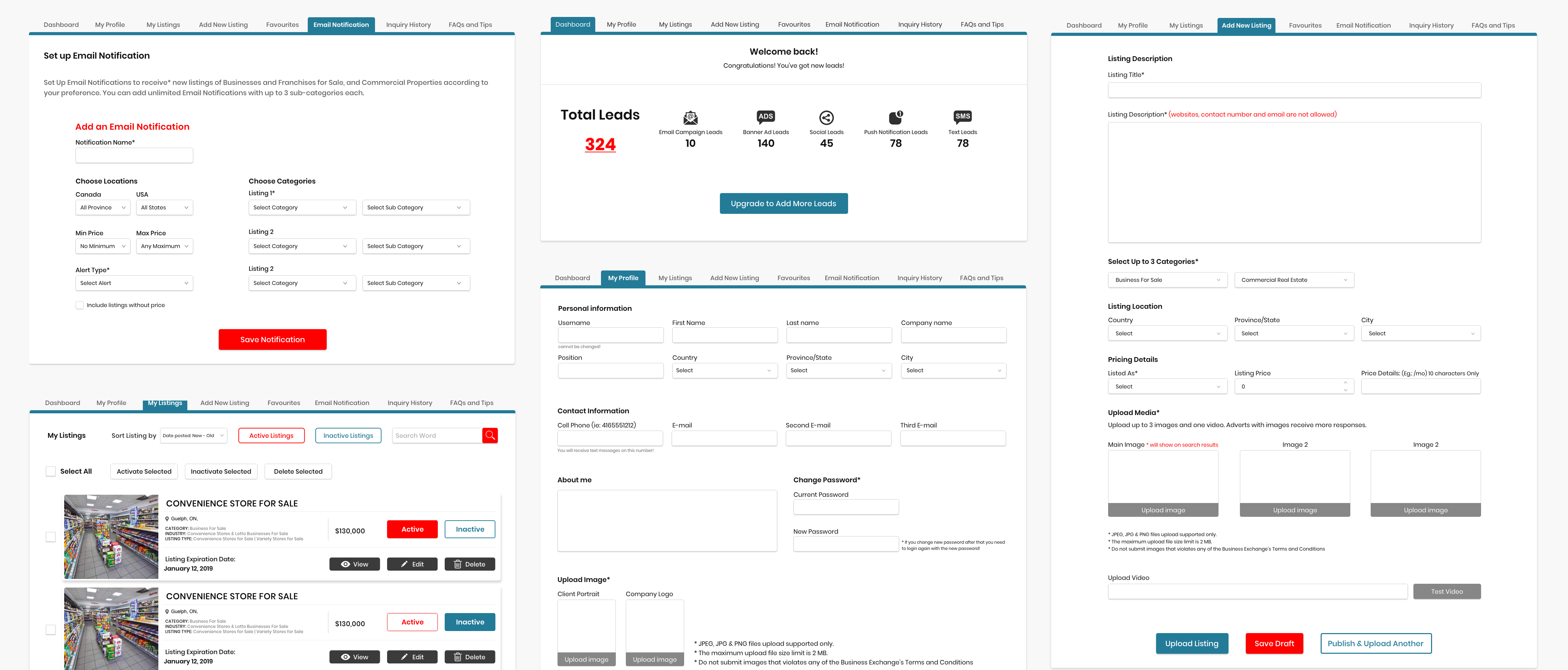
  • CLIENT'S DASHBOARD & PROFILE PAGES REDESIGN

    PROBLEM & CHALLENGE

  • The original client's dashboard and profile pages lacked intuitive navigation and clarity, making it difficult for users to efficiently manage their listings and account settings.
  • Key features were not easily accessible, and the layout was cluttered, which increased cognitive load and caused user frustration.
  • DESIGN SOLUTION

  • Redesigned the clients dashboard and profile pages with a focus on enhancing navigation and improving overall usability.
  • Introduced a clean, intuitive layout that grouped related tasks together and used clear, consistent labeling to help users quickly find what they need.
  • Optimized the interface for responsiveness, ensuring a smooth and seamless experience across all devices.
  • The result is a more user-friendly dashboard that empowers clients to manage their accounts and listings efficiently, with minimal effort.
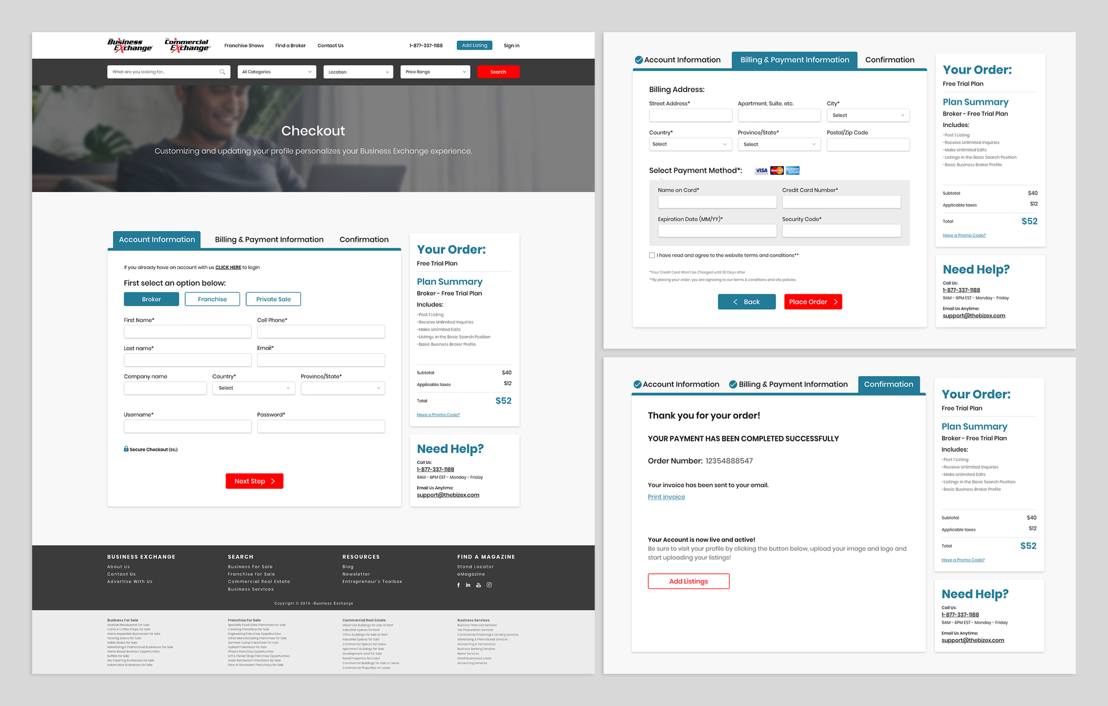
  • CHECKOUT PAGE REDESIGNING

    PROBLEM & CHALLENGE

  • Users found it difficult to navigate through the checkout process, lacking clear indicators of their current step and how to proceed or return to previous steps.
  • Additionally, users were unable to view a comprehensive summary of their order, including pricing and additional costs, throughout the checkout process, leading to uncertainty and potential card abandonment.
  • SOLUTION

  • Implemented a streamlined three-step process: ACCOUNT INFORMATION (Users input their account info), BILLING & PAYMENT INFORMATION (Users provide payment details) and CONFIRMATION (Users review their order before finalizing the purchase.)
  • Persistent Order Summary: Displayed a summary on the right side of the checkout page, showing a detailed breakdown of items, prices, taxes and total amount, ensuring transparency.
  • Editable Information: Enabled users to easily return to previous steps to edit shipping or payment information without losing entered data, enhancing flexibility and user control.
  • Each stage is highlighted so that as the users proceed in the flow, they know which stage they’ve reached and in each step they can review their orders as well.
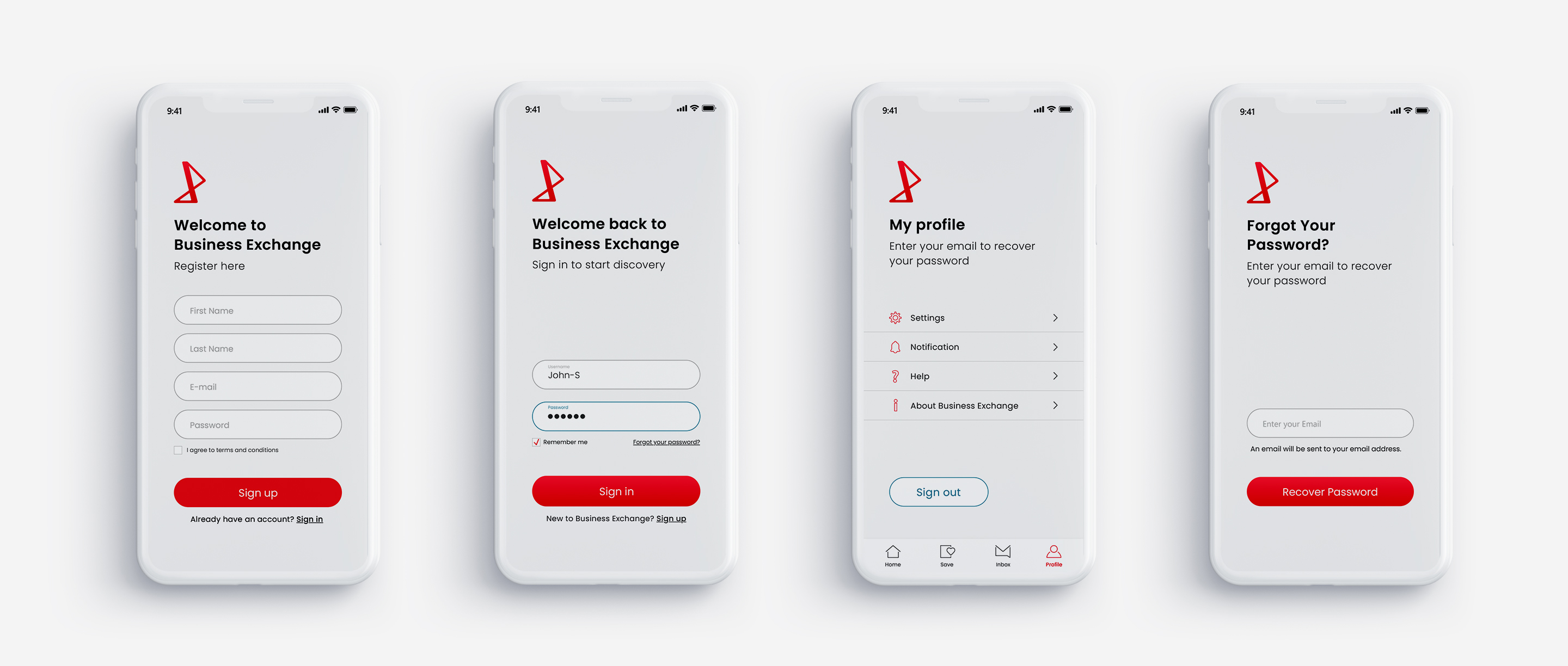
  • BUSINESS EXCHANGE MOBILE APP DESIGN

    Led the design of the Business Exchange mobile app, covering everything from the app icon and splash screen to customized icons, as well as key user flows like sign-in/sign-up, search, and listing pages. My goal was to create a cohesive, visually engaging, and intuitive mobile experience that reflects the brand identity while supporting users in discovering and managing business opportunities on the go.


    APP ICON DESIGN

    The app icon serves as a key visual element that shapes the first impression of the brand. Inspired by the letter "X" from the Business Exchange logo and incorporating the brand’s primary color, the icon was designed to be bold, recognizable, and aligned with the overall visual identity.

    CUSTOM ICONS DESIGN

    A tailored set of custom icons was designed to ensure visual consistency and enhance the overall user experience across the app. Each icon aligns with the app’s aesthetic and reinforces a cohesive, intuitive interface.

    SPLASH SCREEN & SING IN / MOBILE APP

    The Business Exchange mobile app was designed with smooth, soft transitions to create a dynamic and engaging user experience. Below is the login screen and its transition into the home screen, showcasing a seamless and polished entry point into the app. The prototype is provided below to demonstrate these interactions in action.

    LISTINGS PAGES / MOBILE APP

    Designed for a seamless user experience, the mobile app listing page features a clean and intuitive layout. A search bar at the top allows users to quickly find listings, while easily scrollable listings just below provide quick access to property types, making it simple to switch between options.
    To ensure smooth navigation, a fixed bottom navigation bar includes Home, Search, Inbox, and Profile, giving users easy access to key areas of the app at any time.
    Each listing includes Like and Save buttons to keep track of favorites, along with a Contact Agent button. Users can also message the agent directly, making communication fast and convenient.
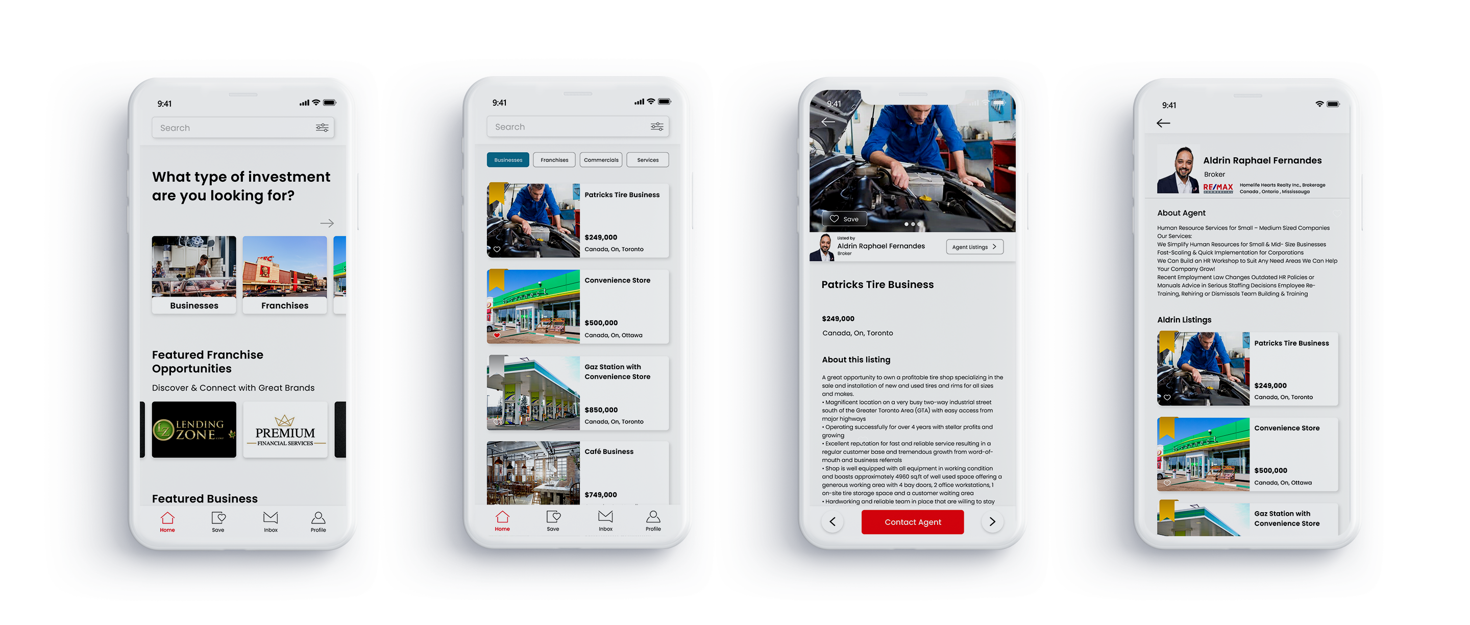
    SEARCH / MOBILE APP

    Designed with simplicity and efficiency in mind, the search bar sits at the top of the mobile app listing page. When tapped, it seamlessly takes users to a dedicated search page, where they can filter listings based on their specific needs. Users can easily:
    Select the categories they want to browse (e.g., rentals, sales, commercial)
    Choose their country or region for location-based results
    Set a price range to match their budget.